For Marketers, the ultimate goal is to persuade consumers to make a purchase.
Experienced marketers know that influential words and enticing images alone will not enable them to achieve their goal. Instead, they have to support their initiatives with psychological tools to connect with customers, convey brand messages and drive conversions.
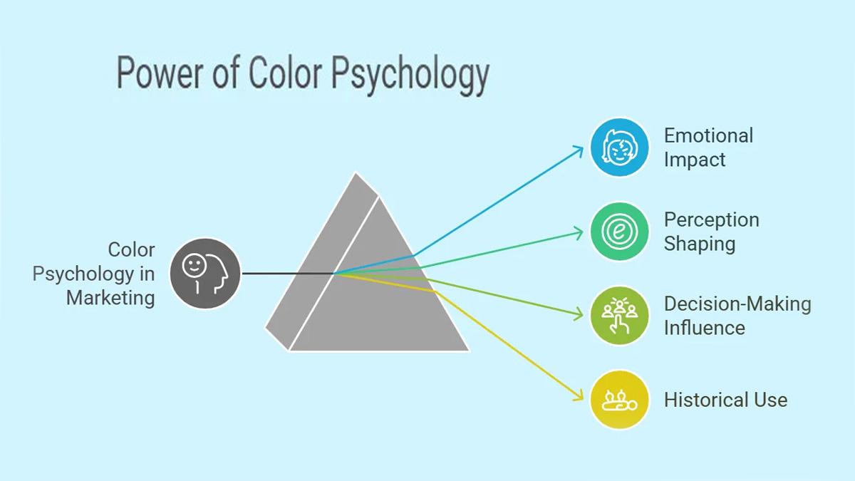
One such tool at their disposal is color, which can enhance their messages, inspire consumers to take action or help them stand out from their competitors. Not surprisingly, understanding the psychology of color is essential for developing winning marketing campaigns and creating persuasive brands.
Color is ubiquitous and is a source of information. People make up their minds within 90 seconds of their initial interactions with either people or products. About 62‐90 percent of the assessment is based on colors alone. Visuals and copy matter, but they’re not always enough. To truly connect with your audience and inspire conversions, you need something more profound — something intuitive.
That’s where color psychology marketing comes in. In the first few seconds of product interaction, color does the heavy lifting, shaping perception, sparking emotion and even driving action. When used strategically, color can elevate your message, influence consumer behavior and set your brand apart.
What Is Color Psychology?
Color psychology explores how different hues affect our thoughts, emotions and behaviors. While this concept has ancient roots (Egyptians and Chinese used it in healing practices), it’s now a powerful tool in digital marketing, branding and design.
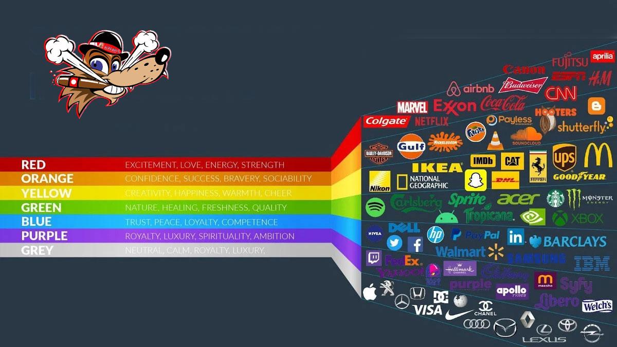
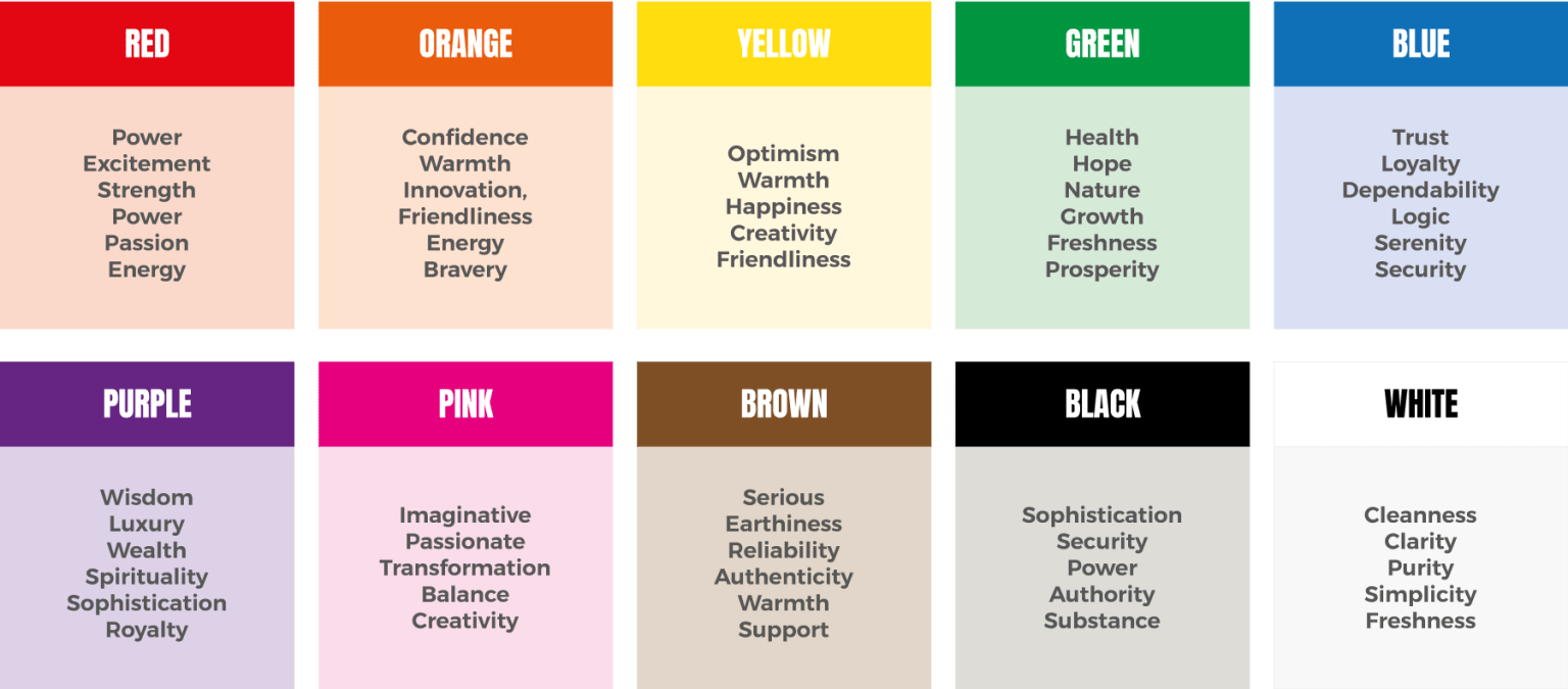
Before we dig deeper into how colors influence perception, let’s look at these fundamental color-emotion associations reported in psychological literature:
The Influence of Colors on Emotions and Behavior
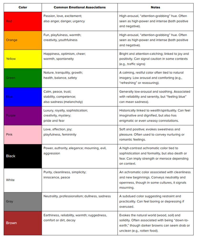
Color can stir strong emotional reactions. Warm colors like red, orange and yellow elicit high-energy emotions (excitement, passion, urgency). On the other hand, cool colors like blue and green are more calming. Studies even suggest that they can reduce anxiety and slow breathing, which is why they’re so common in healthcare and finance branding.
This color psychology chart can help visualize these concepts:
Personal experiences, culture and even environment affect how people respond to colors. According to color-in-context theory, the same color can carry very different meanings depending on where and how it’s used. A soft green might feel peaceful in a natural setting — but off-putting when associated with spoiled food.
“While red can evoke urgency or passion in Western cultures, it signifies prosperity and luck in China. Similarly, blue is often associated with trust and calmness, but it can also be perceived as cold or corporate, depending on the context,” said John LLoyd Edios, Demand Generation Senior Design Manager. “Marketers should consider cultural differences, industry trends and brand positioning rather than relying on blanket color associations.”
The Use and Psychology of Colors in Marketing
In digital marketing, color choices are strategy-driven. The colors you choose influence how consumers perceive your brand and whether they take action, from clicking a button to making a purchase.
Marketing color psychology focuses on how color affects consumer behavior. With it, we understand how red “Sale” tags often drive impulse buys (red signals urgency and grabs attention). Conversely, cooler hues like blue and green create a sense of calm, encouraging shoppers to spend more time browsing, whether in-store or on a website.
We can see what is color theory for in all this: it helps designers and marketers understand how color combinations work, ensuring every visual element supports a brand’s identity and emotional goals.
The Psychology of Color in Branding
A study in Marketing Theory found that people judge a brand’s use of color based on how appropriate it feels. A color that seems off-brand can weaken the consumer’s emotional response — even if it’s appealing.
“The effectiveness of a brand’s color scheme depends more on coherence with the brand’s personality and message than predefined color meanings,” Edios said. “For example, while luxury brands often use black and gold, Tiffany & Co. is instantly recognizable due to its signature blue — showing that a strong brand association can be built outside traditional color stereotypes.”
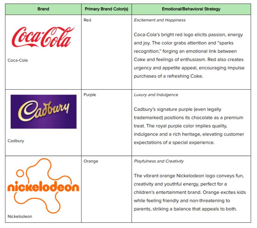
Let’s look at some notable examples of brand color strategies:
These brands have intentionally chosen colors to reinforce their values. In each case, the color becomes a shorthand for the brand’s personality.
How To Choose Brand Colors
A strong palette of brand colors builds emotional connection and recognition, but choosing the right colors takes intention. Here are some fundamental steps to take as you develop your brand color palette:
Align Color With Brand Values
Choose colors that reflect your industry and your brand’s tone. Edios emphasizes that your chosen colors should align with your brand’s personality and tone. For example, if you run a financial site, your color scheme should feel stable and trustworthy.
Consider Your Audience’s Preferences
Age, gender and personality shape how people respond to color. Bright, bold hues may appeal to younger audiences, while mature or corporate groups may prefer muted, sophisticated palettes.
Be Mindful of Cultural Meanings
Colors carry different meanings worldwide. White may symbolize purity in the West but mourning in parts of Asia. Red means good fortune in China but can imply danger elsewhere.
If your brand spans multiple markets, it’s best to study regional associations.
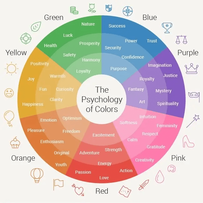
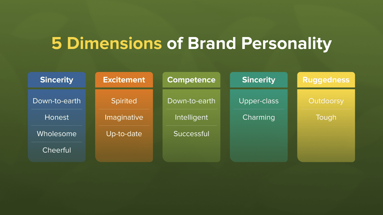
Here’s another helpful color psychology chart based on psychologist and Stanford professor Jennifer Aaker’s research. It shows five core traits that shape how audiences perceive a brand’s personality.
When struggling with how to choose brand colors, it helps to ask, “Is this color appropriate for what I’m selling?”
How Many Colors Should a Brand Have?
Choosing the correct number of brand colors is as important as choosing the right hues. “Some brands pick too many colors, diluting their identity,” Edios said. While the number of brand colors ultimately depends on your brand’s needs, Edios describes a solid system to include:
Primary Color (1-2): The core brand identity.
Secondary Colors (2-4): Complements for design flexibility.
Accent Colors (1-2): Used sparingly to highlight key elements.
Too many colors can feel disjointed, but too few can restrict creative freedom. Aim for a system that supports both consistency and design freedom.
Using Color in Web Designs To Guide and Engage Users
Building a strong brand identity is essential — but so is converting visitors into customers. While no single color guarantees more sales, marketing color psychology can help brands stand out. One proven tactic is the Isolation Effect, where an element using a unique color pops in a sea of uniform tones. The contrast draws the eye and encourages clicks.
Achieving this contrast in your web design begins with these essentials:
A background color to set the tone
A base color to support the content
An accent color to highlight key actions.
Color Psychology Marketing and User Experience: Enhancing Interactions Through Color
Beyond branding, using color in user experience (UX) design strategically improves usability, accessibility and engagement.
Here are five ways to apply marketing color psychology effectively:
Establish a Clear Hierarchy of Content and Elements
Use contrast to highlight key actions and guide user attention. Assign distinct colors to primary buttons, secondary actions and backgrounds to create structure. Fewer colors make focal points more powerful.
Ensure Accessibility for an Inclusive User Experience
Select high-contrast color combinations to support readability and users with visual impairments. Additionally, don’t rely on color alone. Add text labels or patterns to clarify meaning.
Indicate the Current State of Interactive Elements
Color shifts, like during a hover or click), show users that elements are interactive. As you implement this in your web design, maintain consistency using a core color family and tonal variations for primary and secondary buttons. This use of color enhances the interface’s intuitiveness, allowing users to understand the system’s responses to their actions without confusion.
Reinforce State Changes Through Visual Cues
Combine colors with icons, text changes or animations to signal completed actions. For instance, a call-to-action (CTA) button might turn green and animate slightly after order completion or form submission. Pairing a color change with a slight animation can make interactions more noticeable and engaging.
Continuously Test, Learn and Improve Your Design
Effective color use requires testing and feedback, as Edios notes that CTA colors, for example, don’t affect every audience the same way. Test different options to see what resonates best with your users. With thoughtful design and UX testing, color becomes a powerful tool for enhancing the user experience.
Let’s Turn Color Into a Competitive Advantage
While no one color has been proven to drive sales more successfully than others, the use of color psychology does appear to impact a brand’s ability to make itself stand out. As we’ve seen, the psychology of color plays a decisive role in shaping perception, guiding behavior and building brand identity.
Many brands make use of the Isolation Effect, a principle that suggests that a unique color in a field of uniform hues will stand out more. Brands that apply this psychological principle to brightly colored call-to-action buttons on their monochromatic landing pages, or to bold packaging that stands out among competitors on store shelves, may have much more success in driving consumers to purchase.
After all, what is color theory if not a guide to stronger, more emotional connections? Color is just one of many psychological tools that marketers can use to build successful brands. Using psychology to reach and influence consumers is a specialized field.


Comments