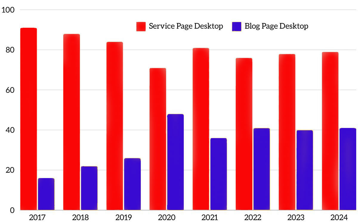
In 2023, we reviewed our website performance and found that 73% of our service page visitors still came from a desktop. For blogs, it has begun to balance out. Just 63% of our blog visitors come from a desktop. Above you can see how this trend has remained true since 2017.
This data makes sense. B2B website visitors are researching services for their company. We know that this is done during the day. When we run Google Ads campaigns, we see that the most clicks come between work hours. We also see roughly 60% of those visits come from a desktop. Conversely, blogs serve more of a professional development purpose, so this higher mobile search stat also makes sense. You’re more likely to read this blog on your commute than you are to read a page about our services. Mobile makes sense.
What is the Difference Between a Mobile-Friendly and a Mobile-Responsive Website?
Almost every website today should be mobile-friendly. If not, you should fire your web dev company immediately. But mobile-friendly does not always mean mobile-responsive.
- In simple terms, mobile-friendly means that the site works on a mobile device and is optimized to make information accessible on mobile. Think of the dropdown menus and other website features that used to be clunky before 2015. That is well behind us.
- Mobile-responsive design goes a step further. It is more adaptive. No matter the screen size—desktop, mobile, or tablet—it scales and responds to work optimally exactly for that screen. But that’s just in the development.
Mobile-responsive sites, especially B2B websites, must also meet user experience needs beyond the interface. That means content, layout, buttons and all of the front-end elements that make a website a delight to browse.
Mobile-Responsive Best Practice
While mobile-first remains a must, no matter where your audience browses from, you have to understand how they consume your content on those different devices. Returning to our website statistics—understanding that our visitors read a lot more blog content on their phones—we learned that our call to action should be placed higher on the page architecture if we want it to be seen.
Make user experience (UX) key
We are well beyond just having all the same content and design adjusting for a smaller screen. It’s about how people interact differently on devices. We know that B2B buyers are more likely to visit your website from a desktop, researching or visiting while at work.
User experience design requires understanding how visitors interact with your website from different devices. This includes mobile and desktop devices as well as tablets, based on what we have seen from countless analytics reports over recent years.
Monitor your mobile-first metrics
In the mobile-first approach, Google considers mobile metrics to determine which sites are mobile-friendly. This includes:
- Site speed
- Legibility
- The interactivity of content and engagement.
We scroll a lot more on phones, making speed, readability, and interactivity far more important than they appear to be for desktops.
Get eyes on your B2B website
The simplest way to test and ensure your B2B website’s mobile responsiveness across different devices and browsers is to get eyes on actuarial devices and test for a few. Try:
- Testing iPhone 15 vs. iPhone SE vs. Android varieties – corporates often use these as ” work phones,” and the screen sizes are very different.
- UX testing software – Mouseflow records video of users’ screens to see how they behave on your site; Hotjar/CrazyEgg and others use heatmaps, form fills, and rage clicks to measure user engagement.
For all of this, the key is to look at the incremental improvements that can make a big difference to conversion rate optimisation (CRO). Changes to small audiences that increase quality leads by 5% can have a huge impact on ROI or ROAS.
Understand the technical specifics
For B2B business owners, the typical knowledge gaps in understanding mobile-responsive website design will be the technical specifics. While an agency or internal expert will most likely take care of this for you, it is still helpful to understand these technical basics to ensure they’re in the scope of work. These include:
- Coding best practices – Using semantic HTML, optimizing images and videos for faster loading, and ensuring that interactive elements are touch-friendly.
- CSS media queries – CSS media queries are pivotal in responsive design as they allow developers to apply different styling rules based on the characteristics of the device viewing the site, such as its width, height, or orientation.
- Frameworks specifically geared towards responsive design – Frameworks like Bootstrap or Foundation can significantly streamline the development of a responsive website. They come equipped with pre-defined classes and components that are already optimised for mobile, tablet, and desktop views.

 By
By 


Comments